import matplotlib.pyplot as plt
import pandas as pd

wide_df = pd.read_csv('../data/wide_data.csv', parse_dates=['date'])
long_df = pd.read_csv(
    '../data/long_data.csv',
    usecols=['date', 'datatype', 'value'],
    parse_dates=['date']
)[['date', 'datatype', 'value']] # sort columns
Wide vs. Long Format Data
Wide vs. Long Format Data
About the data
In this notebook, we will be using daily temperature data from the National Centers for Environmental Information (NCEI) API. We will use the Global Historical Climatology Network - Daily (GHCND) dataset for the Boonton 1 station (GHCND:USC00280907); see the documentation here.
Note: The NCEI is part of the National Oceanic and Atmospheric Administration (NOAA) and, as you can see from the URL for the API, this resource was created when the NCEI was called the NCDC. Should the URL for this resource change in the future, you can search for “NCEI weather API” to find the updated one.
Setup
Wide format
Our variables each have their own column:
wide_df.head(6)| date | TMAX | TMIN | TOBS | |
|---|---|---|---|---|
| 0 | 2018-10-01 | 21.1 | 8.9 | 13.9 |
| 1 | 2018-10-02 | 23.9 | 13.9 | 17.2 |
| 2 | 2018-10-03 | 25.0 | 15.6 | 16.1 |
| 3 | 2018-10-04 | 22.8 | 11.7 | 11.7 |
| 4 | 2018-10-05 | 23.3 | 11.7 | 18.9 |
| 5 | 2018-10-06 | 20.0 | 13.3 | 16.1 |
Describing all the columns is easy:
wide_df.describe(include='all')| date | TMAX | TMIN | TOBS | |
|---|---|---|---|---|
| count | 31 | 31.000000 | 31.000000 | 31.000000 |
| mean | 2018-10-16 00:00:00 | 16.829032 | 7.561290 | 10.022581 |
| min | 2018-10-01 00:00:00 | 7.800000 | -1.100000 | -1.100000 |
| 25% | 2018-10-08 12:00:00 | 12.750000 | 2.500000 | 5.550000 |
| 50% | 2018-10-16 00:00:00 | 16.100000 | 6.700000 | 8.300000 |
| 75% | 2018-10-23 12:00:00 | 21.950000 | 13.600000 | 16.100000 |
| max | 2018-10-31 00:00:00 | 26.700000 | 17.800000 | 21.700000 |
| std | NaN | 5.714962 | 6.513252 | 6.596550 |
It’s easy to graph with pandas:
wide_df.plot(
    x='date', y=['TMAX', 'TMIN', 'TOBS'], figsize=(15, 5),
    title='Temperature in NYC in October 2018'
).set_ylabel('Temperature in Celsius')
plt.show()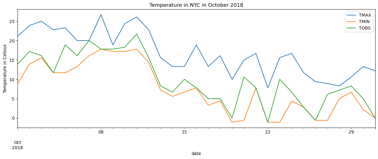
Long format
Our variable names are now in the datatype column and their values are in the value column. We now have 3 rows for each date, since we have 3 different datatypes:
long_df.head(6)| date | datatype | value | |
|---|---|---|---|
| 0 | 2018-10-01 | TMAX | 21.1 |
| 1 | 2018-10-01 | TMIN | 8.9 |
| 2 | 2018-10-01 | TOBS | 13.9 |
| 3 | 2018-10-02 | TMAX | 23.9 |
| 4 | 2018-10-02 | TMIN | 13.9 |
| 5 | 2018-10-02 | TOBS | 17.2 |
Since we have many rows for the same date, using describe() is not that helpful:
long_df.describe(include='all')| date | datatype | value | |
|---|---|---|---|
| count | 93 | 93 | 93.000000 |
| unique | NaN | 3 | NaN |
| top | NaN | TMAX | NaN |
| freq | NaN | 31 | NaN |
| mean | 2018-10-16 00:00:00 | NaN | 11.470968 |
| min | 2018-10-01 00:00:00 | NaN | -1.100000 |
| 25% | 2018-10-08 00:00:00 | NaN | 6.700000 |
| 50% | 2018-10-16 00:00:00 | NaN | 11.700000 |
| 75% | 2018-10-24 00:00:00 | NaN | 17.200000 |
| max | 2018-10-31 00:00:00 | NaN | 26.700000 |
| std | NaN | NaN | 7.362354 |
Plotting long format data in pandas can be rather tricky. Instead we use seaborn:
import seaborn as sns

sns.set(rc={'figure.figsize': (15, 5)}, style='white')

ax = sns.lineplot(
    data=long_df, x='date', y='value', hue='datatype'
)
ax.set_ylabel('Temperature in Celsius')
ax.set_title('Temperature in NYC in October 2018')
plt.show()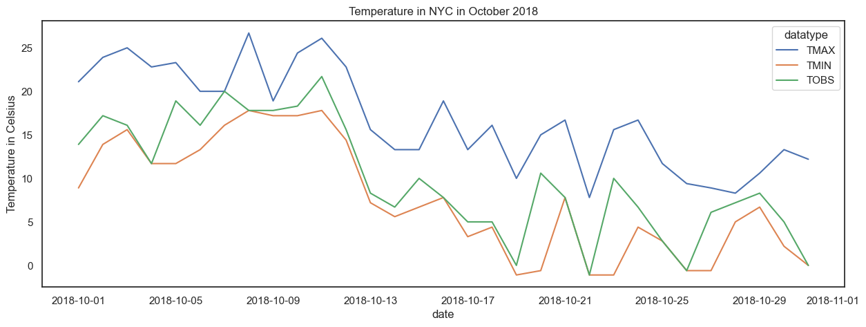
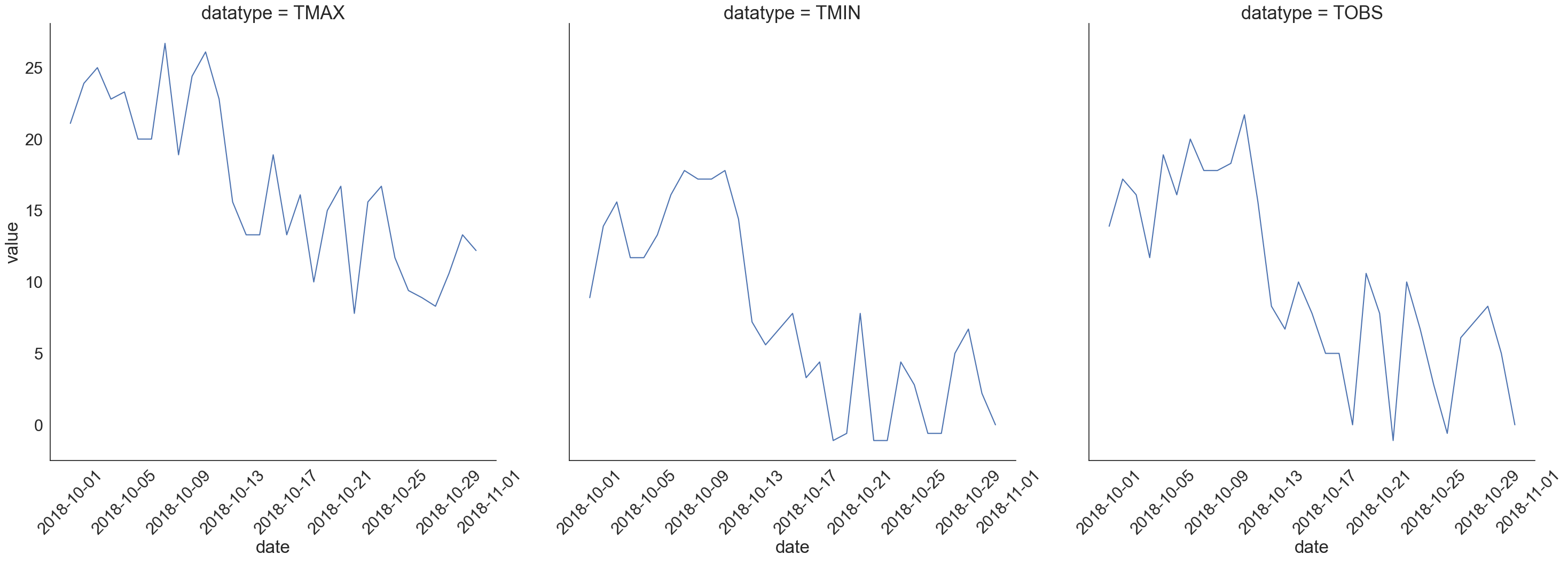
With long data and seaborn, we can easily facet our plots:
sns.set(
    rc={'figure.figsize': (20, 10)}, style='white', font_scale=2
)

g = sns.FacetGrid(long_df, col='datatype', height=10)
g = g.map(plt.plot, 'date', 'value')
g.set_titles(size=25)
g.set_xticklabels(rotation=45)
plt.show()